Guide on color combinations
Today we want to offer you a complete guide to the combination of colors in the field of fashion, with all the basic rules and the most advanced ones to really be runway-proof.
Learning what the best color combination is can, in fact, come in handy on any occasion.
The guide is very long and complete, so let's not get lost in further preambles and immediately see together everything that is needed to match colors in clothing, from theory to practice.
As banal and obvious as it may seem, I would start with the definition of "color combination".
By color combination we mean the combination of two or more colors in order to make the harmony and synergy between them perfect.
We have often talked about color matching as a simple and obvious thing, but I assure you that color matching can really be considered as an exact science: in some cases, the contexts of high fashion, always on the lookout, can be an exception. of color combinations and experiments in order to create a wow effect (and, as such, even beyond all logic)
Before tackling the specific color combination, it seems only right to open a big parenthesis and take a leap on a work of art without which we would not be here talking about colors or even less about color matching.
THE CIRCLE OF ITTEN


Have you ever heard of the Itten color circle? Have you ever seen this image?
Now I'll explain how this circle should be interpreted: it starts from the central triangle, all the possible color combinations imaginable come from here, from three colors.
To get a clear picture of the combination of colors and how the various colors are born, we divide the latter into three sections:
1. primary colors
2. secondary colors
3. tertiary colors
(Figure 2)
Primary colors
The primary colors are those that give rise to all color combinations, the basic colors, which as we can see in the figure below, are those inside the central triangle, namely:
* yellow
* cyan
* magenta
Secondary colors
The secondary colors are obtained by mixing in equal parts, with the same proportions and percentages, pairs of primary colors obtaining:
* orange (yellow + magenta)
* green (cyan + yellow)
* purple (magenta + cyan)
Looking at the figure above, it can be seen that there is a relationship between a transverse primary color and the two neighboring secondary ones, that is: yellow belongs to both orange and green, cyan belongs to both purple and green and, finally, magenta belongs to both orange and purple.
Tertiary colors
Tertiary colors are obtained by mixing a primary color and a secondary color placed adjacent on the six-part color wheel (Figure 2).
With the three primary (yellow, cyan, magenta), the three secondary (orange, green, purple) and the six tertiaries, the twelve-part chromatic circle is created (figure 2), and then one could proceed indefinitely in the mixing of pairs of colors.
Here is the list of the six tertiary colors:
* red-purple
* blue-violet
* blue-green
* yellow green
* yellow-orange
In the meantime you become familiar with the color wheel and various color combinations, I want to guide you, as promised, with some examples illustrated by images on how to match colors in a perfect and compatible way.
So, after explaining to you how color combinations work, we have prepared a nice color scale with their matching colors:
* red
* light green
* light blue
* beige
* Orange
* Brown
* blue
* dark green
* black
* grey
* lilac
* teal
* purple plum
* rose
* purple eggplant

Before diving into an even more technical and detailed color combination, it is advisable to explain to you that there are further variations to understand how vast the topic on colors is.
Making a very brief summary, after having seen the Itten circle, the basics on the combination of colors (and on how they are born), what are the primary, secondary and tertiary colors, the various compatibilities of each single color, the time has come to make another important distinction.
Are you wondering which one? I'll tell you right away!
This distinction includes:
1. warm colors
2. cool colors
(figure 2)
* Warm colors are those closest to infrared within the visible spectrum (red, yellow, orange)
* Cold colors, on the other hand, are the shades closest to ultraviolet rays (blue, green, purple)
By mixing warm colors (red-orange-yellow) and cold colors (green-blue-violet) it is possible to obtain expressive values that can be traced back to shaded-sunny, near-far, light-heavy, transparent-opaque effects.
7 rules for a perfect color match
There are several ways and schemes to create a perfect color match.
Now that you have more mastery on the subject and would like to arrange your wardrobe by giving it a logic based on the colors, if you want to know which ones are best suited to your needs or simply to your taste, I have prepared a nice guide to match the colors in so that you can't miss a shot, but on the contrary be perfectly matched.
So, take the twelve-part Itten circle and don't worry, I'll help you understand with the pictures.
Now we come to the 7 rules I was telling you about
1. match monochromatic colors
2. match similar colors
3. Match the expanded analog colors
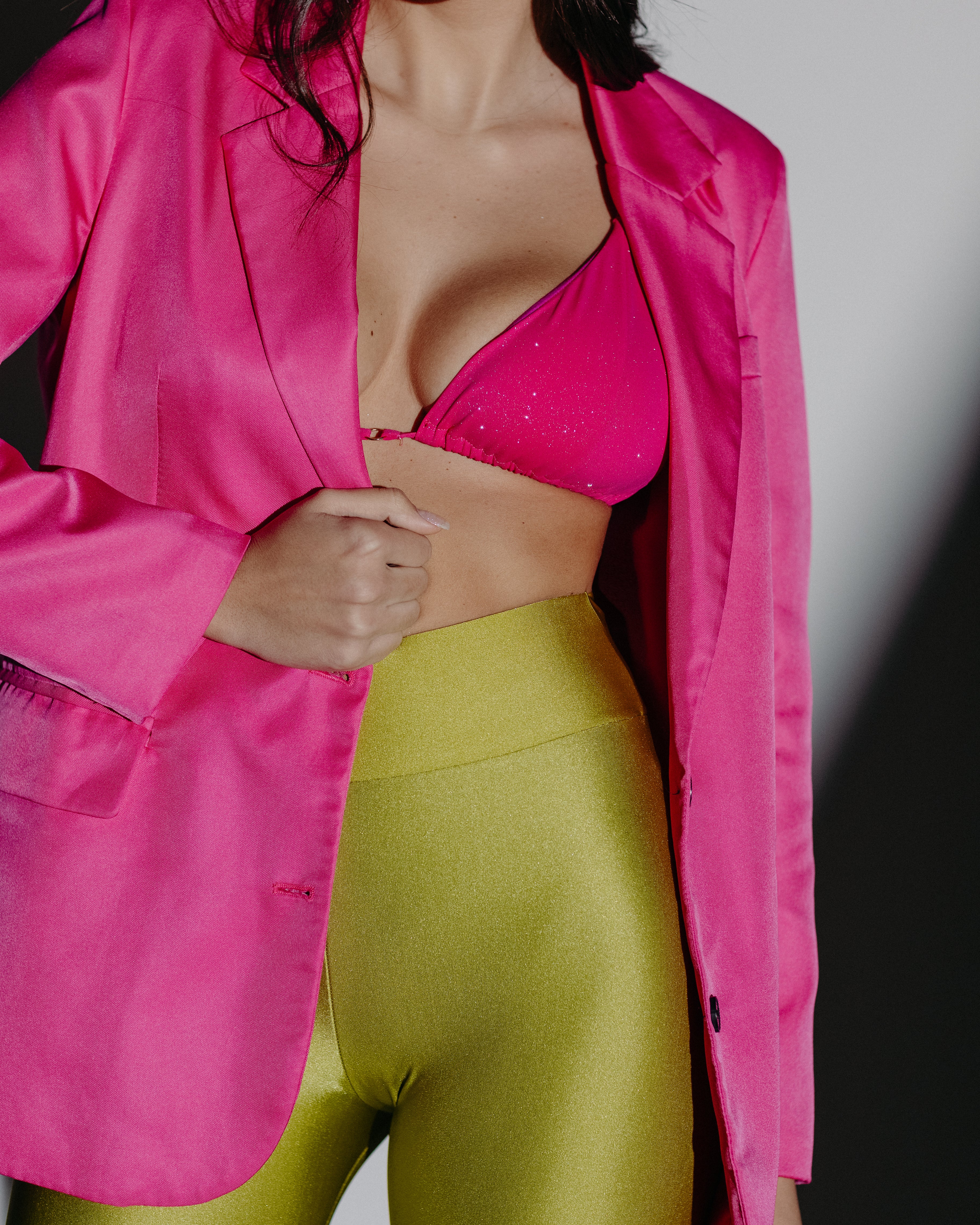
4. match complementary colors
5. match divergent complementary colors (3 colors)
6. match the colors to 3 equally spaced colors on the circle (triad)
7. match the colors to 4 equally spaced colors on the circle (quartet).
Monochrome combination
The monochromatic color combination is a composition of the color chosen as a sample with its shades and declinations without contrasts, as can be seen from the image above.
In this type of combination a single color dominates resulting in a simple and minimalist matching composition.
Analogous color matching
The combination of analogous colors is formed starting from a base color and following its adjacent tones and shades.
As you can see from the image this combination can be very simple.
The pairing of these colors is consistent and balanced, but also very flat and boring because it does not have great contrasts between colors, but uses the shades of its main color, so it shows a pairing of colors located close together in the color wheel.
Expanded analogue color matching
The expanded analogue color scheme is very similar to its predecessor in that it uses the same color distribution scheme, with the only difference that it extends even further into the shades of colors close to the dominant color, which is why it is defined as expanded.
This type of scheme allows us to create an even wider color combination than the previous one, with more shades but roughly the same harmonic character.
Complementary color combination
Complementary color pairing uses two colors with distinctly opposite positions within the color wheel.
It is a very powerful and energetic color combination, so with these colors you can create very lively combinations, but at the same time you have to be careful to manage them well so as not to make them look too strong together, so try to manage them well.
Divergent complementary color matching (3 colors)
The divergent complementary color pairing is similar to the previous one, but in this case the chosen base color is not combined with the opposite complementary color in the wheel, but with the two colors adjacent to the opposite one.
This type of color combination allows us to create very pleasant contrasts compared to complementary colors because the tones are more balanced and are less contrasting and more in harmony.
Color matching to three equally spaced colors (triad)
Color matching to three equally spaced or triad colors consists of matching three colors located at equal distances from each other within the color wheel.
The characteristic that derives from this color combination is that different tones of each color are combined and the result is a very varied combination, with great contrast, but very balanced.
One very important thing to say about this type of combination (in order not to create a real jumble), is that the colors must have the same chromatic value, so either all three dull colors, or all three bright colors.
Equidistant Four-Color Matching (Quartet)
The color pairing of four equally spaced colors is a prime example of how you don't mess around with colors at all.
Although this color combination uses four of them (in the face of those who might say that there are too many) it is a clear example of how even four colors can live in harmony with each other, without being discordant but on the contrary perfectly balanced.
The color combination with four equidistant colors (occupying 4 spaces within the twelve-color chromatic circle, therefore one color every two spaces) inevitably creates warm-cold, off-on, therefore polychromatic, heterogeneous and very intense color combinations. .
5 tips you absolutely need to know
Once you have established the basic rules on the theme, the various color combinations and how best to choose them, now I want to give you some valuable advice that will surely add value to your knowledge of color combinations as well as to your wardrobe and your style.
Here are 5 tips you absolutely need to know:
1. Match solid colors
2. Combine dull colors with strong contrasts
3. Match solid colors with patterns
4. Combine neutral colors
5. Match the colors using the accessories
Match solid colors
A solid color combination (monochromatic) can undoubtedly have its charm, but obviously it all depends on the colors you choose and the season in which we find ourselves and above all on the occasion we are about to face.
For example, a combination of solid colors with yellow in the middle of winter or at a gala evening (where dark colors prevail and it makes more sense) is not at all suitable, on the contrary it can be right for a sports session or to go to the sea.
The secret to making this combination functional is to find colors that are not too strong and bright. So pay close attention to the colors you choose for your color match, try to always be suitable for the occasions.
Combine dull colors with strong contrasts
If you want to give a touch of emotion and strength without being too flashy, you can choose a combination of dull colors with strong contrasts.
For example: you can wear a jacket and dark trousers (black, blue) and underneath combine a red or orange shirt.
This choice tends to enhance both colors respectively, moreover it is also very simple to perform and usually turns out to be always a winning choice.
Combine solid colors with patterns
Combining solid colors with patterns is not complicated at all. If you choose the right colors it can give our eyes a great sense of pleasure.
If for example we take a shirt with floral motifs, (where the predominant color is green, followed by red and with small percentages of beige) we look for the color that is in the minority (in this case beige) and from this we understand that the most suitable color combination is beige, so choice is made! Beige trousers!
On the contrary, if you choose one of the two predominant colors (red or green) the combination of colors would be unbalanced and consequently not very harmonious and too noisy.
Match neutral colors
The neutral colors (jeans blue, cream, olive green) allow you to create color combinations and looks that are always in step with the times and with a sure success.
Those who choose this type of color combination are usually a person who does not like to be too flashy and therefore tends to avoid too many color contrasts and strong colors.
Wearing a pair of jeans, with a nice beige, green or blue pullover would be a nice color combination, therefore very practical and never boring, because we use soft and dull color tones.
Carefully creating a wardrobe with neutral color combinations is certainly an advantage for those who do not like to faint on what to wear in the morning, and it is also a very functional choice, because whatever color you choose as a combination (if you have been careful upstream) the colors neutrals always go well together.
Match the colors using the accessories
Using a color combination using accessories to give impetus to your look is definitely another great solution.
Try this color matching scheme that highlights the color of the accessories.
We remind you that in this combination it is advisable to use accessories with stronger shades than the rest of the outfit, always for the concept of harmony (paragraph harmony of colors).
Example: You can match shoes, belt and hat by using the red color on an all-blue suit. The choice to make a color combination using the accessories will certainly make your outfit more dynamic and pleasant.
Written by Claudia Lettera
Leave a comment
This site is protected by hCaptcha and the hCaptcha Privacy Policy and Terms of Service apply.